✍️ AI Data Analysis, Cleaning & Visualization
AI Data Analysis Software for Qualitative and Quantitative Research
DataLumio helps you clean, analyze, visualize, and report data with AI. Upload spreadsheets, PDFs, survey files, research documents, transcripts, or business datasets and turn raw information into clearer insights without coding.
Whether you are working with qualitative research, quantitative data, messy CSV files, PDF reports, or dashboards, DataLumio gives you one practical workspace for faster analysis.
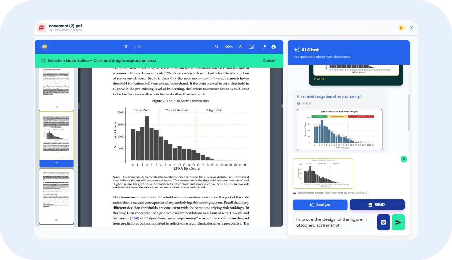
PDF Analysis
Chat with PDFs, review long documents, and analyze selected visual areas.
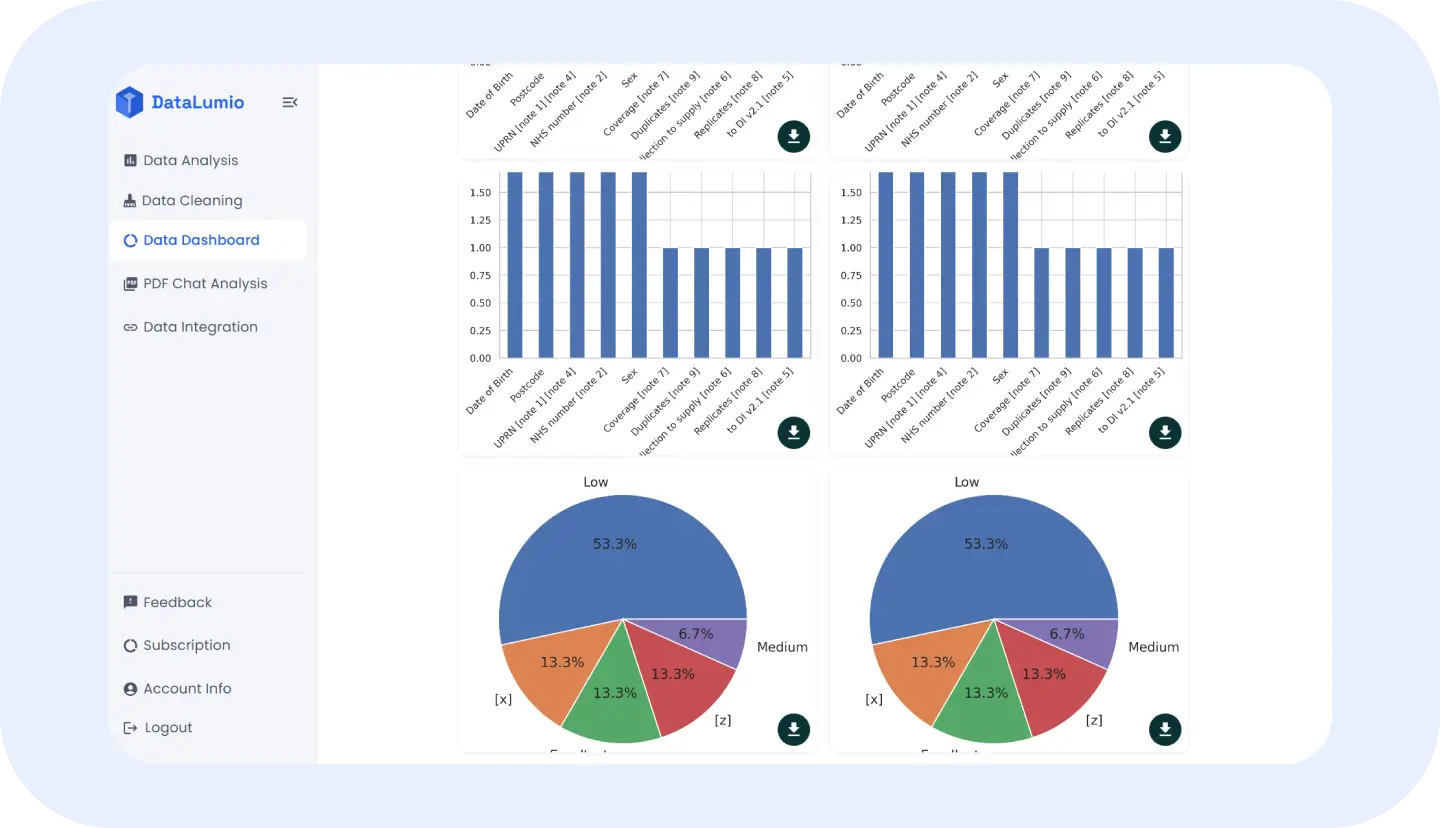
Data Visualization Dashboard
Turn datasets into interactive charts and dashboard views.
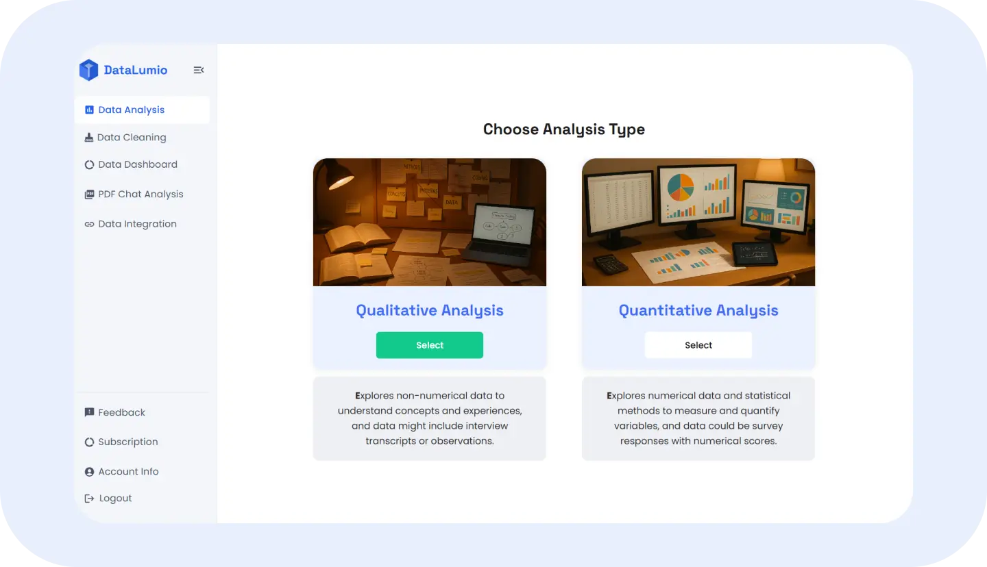
Qualitative & Quantitative Analysis
Find themes in text and analyze structured datasets — no coding.
Trusted by Researchers, Analysts, Students, and Data-Driven Teams
DataLumio is built for people who work with data every day: researchers, students, analysts, consultants, agencies, and business teams. Use real logos, testimonials, user numbers, or report counts here only when verified. Until then, keep this section simple, clean, and focused on the audiences DataLumio serves.

"We used DataLumio to crunch numbers from our recent product feedback forms. The insights helped us pivot fast and the visual reports impressed our leadership team."
Rina Patel
Product Analyst, BrightCore Tech

"DataLumio saved me hours of manual coding. I uploaded transcripts from 12 interviews, and within minutes, I had a clean, visual summary of recurring themes. It’s like having a personal research assistant!"
Maya Collins
Social Science Researcher

"I’m not a data expert, but DataLumio made it easy to analyze survey results for our non-profit project. The charts and summaries were clear, accurate, and presentation-ready."
James Ortega
Program Manager
Turn Messy Data Into Clear Insights Without Manual Analysis
Most data work starts messy. A spreadsheet may have duplicate rows, blank columns, missing values, or inconsistent date formats. A PDF may contain useful information, but the answer is buried across pages. A survey may include both numerical responses and open-ended text. A research project may involve transcripts, notes, tables, and reports that all need to be understood together.
Manual analysis takes time. Users often switch between Excel, PDF readers, AI chat tools, dashboards, documents, and reporting templates just to move from raw files to something useful. For researchers, this can slow down writing and interpretation. For students, it can make analysis feel more technical than it needs to be. For teams, it can delay reporting, decisions, and client work.
DataLumio helps reduce that friction. Instead of starting from scratch, users can upload or connect their files, clean the data, ask questions, generate reports, and create visual outputs from one AI-powered platform.
One AI Platform to Clean, Analyze, Visualize, and Report Data
DataLumio brings multiple data workflows into one place. You can start with a raw spreadsheet, clean common issues, run quantitative analysis, create a dashboard, and generate a report. You can upload text-heavy research files and produce qualitative analysis with themes, quotes, summaries, and insights. You can open a PDF and ask questions while keeping the document visible on screen.
Workflow Steps
How DataLumio Helps You Analyze Data in Minutes
Step 1: Upload or Connect Your File
Start with the file you already have. DataLumio supports different workflows for PDFs, spreadsheets, documents, research files, and connected Google Drive files. Choose the feature that matches your data type.
Step 2: Clean the Data Where Needed
If your spreadsheet is messy, use Data Cleaning before analysis. This helps prepare files by addressing common problems such as duplicates, empty rows, missing values, and blank columns.
Step 3: Run the Right Type of Analysis
Use Qualitative Analysis for text-heavy files, Quantitative Analysis for structured spreadsheets, or PDF Chat Analysis for long documents. Each workflow is designed around a different type of data, so users do not have to force every file into the same process.
Step 4: Create Visual Insights
For spreadsheet data, create dashboard views with charts, KPI summaries, comparisons, distributions, and visual patterns. This helps users understand results faster than scanning raw rows and columns.
Step 5: Review and Export Outputs
Download reports or individual chart outputs where available, then review the results before using them in research, business decisions, presentations, or client work. DataLumio helps speed up the first pass, while the user remains in control of final interpretation.
Built for Research, Business, Surveys, PDFs, and Reports
Academic Research
Researchers can use DataLumio to analyze interview transcripts, review PDF papers, summarize qualitative findings, and work with structured research datasets. It helps organize early analysis before deeper interpretation and writing.
Student Projects
Students can use DataLumio for dissertations, assignments, survey analysis, PDF review, and report preparation. The platform gives them a simpler way to work with data without starting from technical tools.
Survey Analysis
Survey data often includes both numbers and open-ended responses. DataLumio supports quantitative workflows for scores and structured fields, and qualitative workflows for comments, feedback, and written answers.
Business Reporting
Business teams can upload spreadsheets, reports, customer exports, and operational data to generate summaries, charts, dashboards, and analysis outputs. This helps teams move faster from raw files to useful discussion points.
Customer Feedback
Teams can analyze customer comments, feedback forms, support notes, survey responses, and product research files. DataLumio can help identify repeated themes, issues, and patterns across text-based feedback.
PDF Analysis
Users can upload research papers, financial summaries, policy documents, operational reports, and long PDFs, then ask questions about the content. This is useful when key information is hidden inside long documents.
Marketing Data
Marketers can use DataLumio to review campaign exports, survey results, customer feedback, and performance spreadsheets. Dashboards and reports can help turn scattered marketing data into clearer summaries.
Analyze Both Qualitative and Quantitative Data in One Place
Qualitative Data
Qualitative data is usually text-based. It includes interview transcripts, open-ended survey responses, field notes, feedback comments, and research documents. This kind of data is useful for understanding themes, motivations, opinions, experiences, and patterns in language.
Quantitative Data
Quantitative data is usually structured and numerical. It includes survey scores, sales figures, customer records, performance metrics, operational data, and spreadsheet columns. This kind of data is useful for measuring trends, comparing groups, calculating summaries, and creating charts.
DataLumio supports both workflows. Users can generate qualitative reports from text-heavy documents and quantitative reports from structured spreadsheet data. This makes the platform useful for mixed research projects, customer feedback analysis, business reporting, and teams that work with more than one type of data.
Create Data Visualization Dashboards and Insight Reports
DataLumio helps users turn analysis into outputs they can actually review, explain, and share. Instead of ending with raw tables or scattered notes, users can create dashboards, visual summaries, charts, and structured reports.
Dashboard outputs may include KPI cards, bar charts, line charts, scatter plots, histograms, heatmaps, group comparisons, and other visuals depending on the uploaded data and dashboard template. These visuals help users understand patterns faster and make it easier to communicate findings to others.
Reports are useful when users need more than a chart. Qualitative reports can include themes, quotes, sentiment, summaries, and conclusions. Quantitative reports can include descriptive statistics, charts, tables, outlier checks, and plain-language findings depending on the dataset.
This is especially helpful for researchers writing up findings, students preparing assignments, consultants creating client summaries, and business teams preparing internal updates. DataLumio helps create a structured first output that users can review, refine, and reuse.
🛡️ Responsible AI
Analyze Your Data With Privacy, Control, and Confidence
DataLumio is built for users working with research, business, and professional files. When using any data analysis software, it is important to handle files carefully and avoid uploading information that should not be shared or processed through an external tool.
Users should avoid uploading unnecessary sensitive information, private customer records, confidential research material, passwords, financial identifiers, or personal data unless they are comfortable with the platform’s data handling terms and their organization’s policies.
DataLumio supports responsible analysis by encouraging users to review AI-generated outputs, validate important findings, and stay in control of final decisions. AI can help speed up cleaning, summarizing, visualization, and reporting, but human review remains important.
For current details on how DataLumio handles user data, review the Privacy Policy before using the platform for sensitive workflows.
📊 Why DataLumio?
Why Choose DataLumio Over Spreadsheets and Manual Tools?
Spreadsheets are useful, but they can become slow when users need to clean messy files, generate reports, create charts, or analyze both text and numerical data. Manual analysis often requires repeated formatting, formulas, copy-pasting, chart setup, and report writing.
Generic AI chat tools can help explain text, but they are not always built around structured data workflows, file-specific reports, dashboards, or cleaning steps. Traditional BI tools are powerful, but they can require setup, training, and manual dashboard configuration.
DataLumio sits between those options. It gives users a practical AI-assisted workflow for common data tasks: cleaning files, analyzing PDFs, working with qualitative and quantitative data, creating dashboards, and generating reports.
It is not meant to replace every advanced analytics, statistics, or BI workflow. It is designed to help non-technical users, researchers, students, consultants, and teams get to useful first outputs faster.
Learn Better Ways to Analyze, Clean, and Visualize Data
The DataLumio Blog gives users practical guides for working with data more clearly. It is built for researchers, students, analysts, marketers, consultants, and teams who want useful explanations without unnecessary technical jargon.
How to Analyze Data With AI
A beginner-friendly guide to using AI for cleaning, summarizing, visualizing, and reporting data.
Read Guide →Best Data Cleaning Tools for Messy Spreadsheets
A practical guide to duplicate rows, missing values, blank columns, and why cleaning matters before analysis.
Read Guide →Qualitative vs Quantitative Data Analysis
A clear explanation of the difference between text-based and numerical analysis, with examples for research and business.
Read Guide →How to Turn Spreadsheet Data Into a Dashboard
A guide to dashboard basics, chart types, KPI summaries, and visual data analysis.
Read Guide →Start Turning Your Data Into Clear Insights Today
Bring your spreadsheets, PDFs, surveys, research files, and business datasets into DataLumio. Clean messy data, analyze qualitative and quantitative files, create dashboards, chat with PDFs, and generate reports from one AI-powered platform.
Start with your own file, watch the demo, or compare pricing to choose the right workflow for your data.